EOY Report for the Strangest Year Ever
3May 5, 2021 by Dr. Robbie Barber
Last May, I wrote about the process of creating an end of year report. You have to get the right starting point, try to mix the quantitative data with the qualitative data to tell your story. From a librarian’s perspective, this wasn’t the best year to gather the traditional quantitative data. Our school system was 100% virtual until January. Then teachers were in the building. Then in March, students could choose to be in the building which meant all of the classrooms went from 100% virtual to a mix of in-person/virtual, a.k.a. hybrid. How do I describe this year in a report?
Following last year’s advice, I started making a list of items in a Word doc. Then I remembered to grab my SMART goals documentation and pop that in and add notes. It’s less organized than last year but it was good enough. I looked at my database use for quantitative data. It wasn’t good compared to previous years. I looked at my Sora (ebook, e-audiobook) data. Less than 50 people had used it this year. Does that mean it’s a failure? NO. It’s a matter of training, practice, and encouragement. Plus, as I’ve said frequently this year – Zoom fatigue is real – and many students do not want to have one more thing on an electronic device. Still, with no physical library visits until March and then very controlled, I don’t have a lot of checkouts. I did – almost every Wednesday from September til now – sit outside for 2 hours that day for curbside checkout. It was a major win if a student (singular) came up during the two hours and checked out a book. Many weeks were lonely. So in looking for quantitative data, I’m obviously going to use something different than last year. Which brings me to the most important point of all:
Own Your Data.
I am not being snarky. Last year, I showed how the Gale database data had changed over the three years I had been teaching it. I did not want to show one year’s effort. I did not think that told the story or frankly looked very good. The trick is to tie your quantitative data to the story (qualitative data). I am responsible for making sure it is clear the effect I have on teaching. I know that showing something in the moment is sometimes very effective. But it is also clear that sometimes you need to show data as a function of time. In the strangest year ever, I need to ask what data do I have and then how to organize it?
My book circulation was very low this year – both physical books and e-books. The number of classes I taught was low, in comparison to normal years. But the time I spent teaching teachers to use educational technology was mind-boggling. And the hours! I received calls, texts, and emails starting at 6am in the morning and often got calls from teachers at 9pm. I quickly figured out that the early morning people could be put off til at least 7am 🥱. The 9pm teachers were the ones dealing with small children at home while teaching from home. At 9pm, when their own children were asleep, they would start working on the next days lessons and run into issues. And, let’s not forget the students who were having difficulty and the parents who just needed one-on-one help. (By the way, my proudest moment of help was correctly diagnosing that a teacher’s home router did not have the latest up-to-date software to handle some things, and talked her into upgrading her router which worked!) I have a lot of data on how many hours I worked. But then, so did everyone else in the pandemic, except those who gave up. Was I necessary to the operations of the school this year? YES. And, I wrote my SMART goals with that in mind. (For information on setting SMART goals, read this blog on KnowledgeQuest.)
I started the infographic with my three required SMART goals. It can be a consistent method of organizing, even while the goals may change each year. Then I looked at my notes to see what other things popped out. I noticed a number of grants and the different roles I played during the year. Sometimes a long list of things is the best way to present that data instead of a single number. With that in mind, I created an infographic that had 5 elements. I use Canva and looked for a template that was broken into 5 parts. Remember to not make my mistake from last year. Data organized first, then infographic.
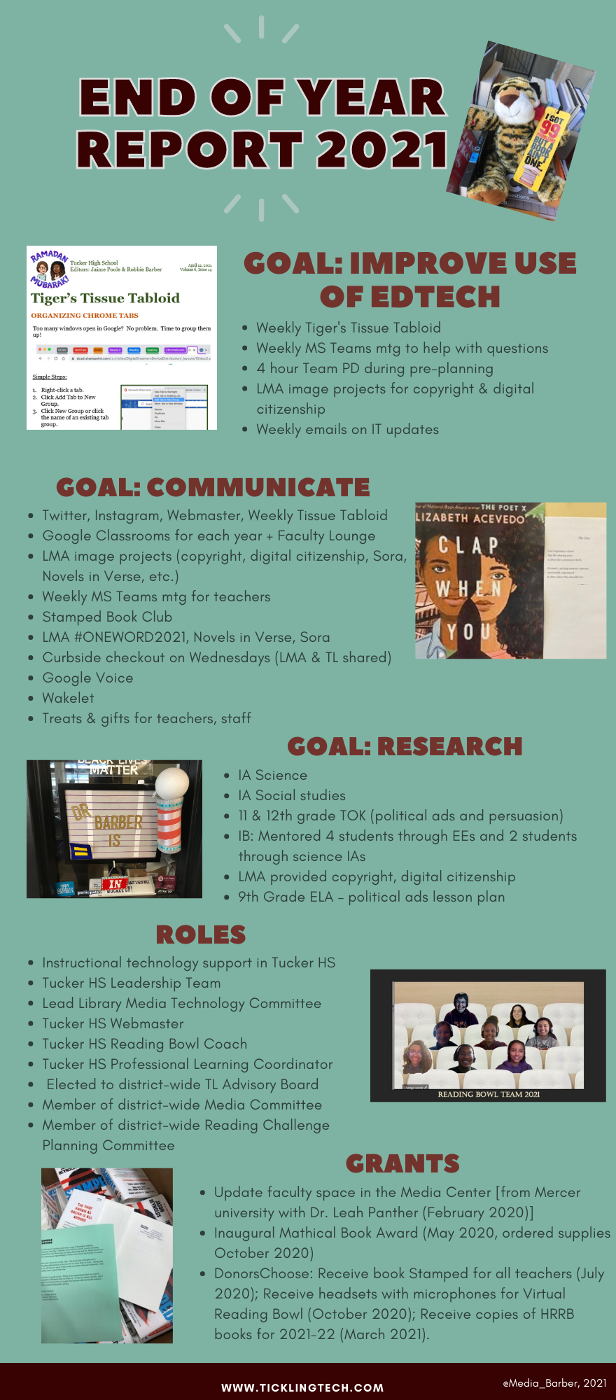
My Library Media Assistant (LMA) reviewed and corrected it. But she wanted me to do something different. Maybe a slideshow. Part of me did not want to do a slideshow because video slideshows are ALL we’ve done at the school this year. Every event was a voice over PowerPoint. Enough! Then I thought I’d use this opportunity to show my administration another way of creating a video from a slideshow with different tools. I used Google slides, Slidescarnival, and Loom.
The year is not over. There will be a lot of summer remediation needed. One thing I’ll keep from this year is my 5 Google Classrooms: Class of 2021, of 2022, of 2023, of 2024, and the Faculty Lounge. Yes, Class of 2021 will be archived this summer and the Class of 2025 will come into being. But these four classrooms allowed me to target students better. And, the Faculty Lounge gave all the teachers a sandbox area to talk, play, and tryout things in. Tools will change, software will change, and we need to keep abreast and prepare for next year. But also, we need to take a break from the strangest year ever!

[…] taught other teacher-librarians in the district about writing End of Year Reports and they shared various activities they did, which will only increase my […]
LikeLike
[…] 2021 EOY Report (#StrangestYearEver) […]
LikeLike
[…] EOY21 – Strangest Year Ever […]
LikeLike