EOY Reporting, Especially During COVID-19
5May 12, 2020 by Dr. Robbie Barber
Whether you are a teacher-librarian like me (a.k.a. school media specialist, school library media specialist, media and educational technology instructor) or an instructional support person (technology, curriculum, etc.), you are often tasked with summing up your year’s worth of work. It’s not very easy at all. Who is this for? And what do they want? Am I justifying my whole career?! [Warning: This is a long blog with examples embedded.]

First, breathe. Calm down. Can you capture your every movement in a cohesive manner that others will read and absorb? No. So stop and break this down. By the way, pro hint, you cannot do this in one sitting. It takes time and thought.

Second, open a Word/Google doc/notebook and start making a list. It does not have to be in any order or even connected. Stream of consciousness as you go through your normal routine is okay. But keep in mind that everything changed sometime in March. So make some notes on things you were doing that converted to online.
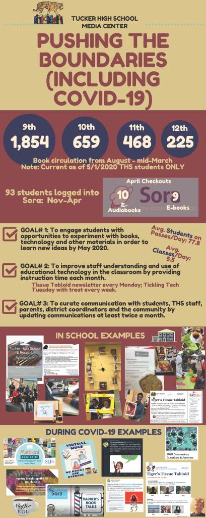
I started with an infographic. Bad choice. It’s a conglomeration of stuff and not in any order and doesn’t make sense despite the load of numbers and pictures. A bad infographic is harder to read than a good document.
I restarted. This time with a notebook. Sometimes, we see things on paper we don’t see online. So I made notes for 2 pages until it became clear that I needed to reorganize and connect things. Now I switched to a Word doc. I started putting in headers to help organize. Do some things belong in multiple headers? Yes. Put them in both. Length of this document is not important. I agree that few will read anything long, but this is the data dump. I wrote more. Then, I started adding pictures into the areas that needed them. Again, no one, even with pictures will read the whole thing. I’m okay with that. In some ways, this exercise helps like writing a resume. There is a lot of information about my skills that you won’t find on my resume. But, you will find areas on my resume that should help you ask questions.
So let’s talk about data. There are a lot of people that really want statistics and numbers (quantitative data) instead of that weird feely stuff (qualitative data). As an engineer, I understand the need for quantitative data. As a new Doctor of Education, I also understand how the qualitative data gives life and depth to the information. We need both but we need to be sure that the numbers do not drive the data reporting. Especially in a job where the line “and all other duties as assigned” can take over your position, it is, in my opinion, more important to lead with the narrative. One of the issues of statistics will always be that you can manipulate the numbers to tell the story you want to tell. Own your numbers.
This year, the district-level send a list for the EOY Report. They ask for required items like SMART goals evaluation, circulation statistics by grade, number of collaborative lessons or class bookings, number of patron visits, professional learning offered, and other programming. Some suggested items included collection analysis, database usage statistics, LMC newsletter, top patrons, awards, grants and recognitions.
Here’s the problem. Depending on your library database, some of these numbers, like circulation by grade, are showing only the students currently in your system as of the day you run the report. If your school has a high mobility rate, than you are not getting accurate data. You can print the information and make a note about it, but how many read the notes when they are looking for numbers?

Third, collect the data that YOU want to share! I ran a report that showed how many books I had weeded this year (a lot!). It also showed how many I had added this year (half the number).
I ran summaries on databases I pay for and then, because I control the data I share, I compared it over a three year period to show a growth of 1086% in usage (In Context High School). I specifically did it over three years because I actively started teaching it during the second year. This year, I finally hit synergy where teachers who would not do it in the past, asked for me to teach students how to use it (classes taught went from 3 to 18 to 30 respectively). It was a major win – so now I can show data on the increase number of classes I taught and how that correlates to the increase usage. Again, I’m controlling the narrative so I consider this a great way to show growth.
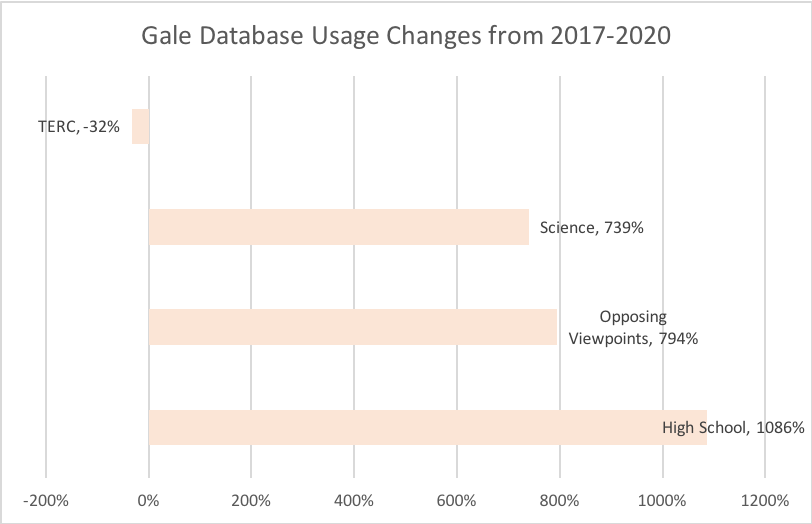
What do you see? The TERC database usage went down. Why? The previous librarian had emphasized that. Global Issues wasn’t available three years ago and it is now. Plus, this is one company’s set of databases. There is another I teach that impacts this use significantly. But you can’t see that data because it is only provided as a district summary. Yes, I can verbalize all this but who is reading it? This graphic allows me to highlight that I’m teaching more and it corresponds to higher usage. Whew!
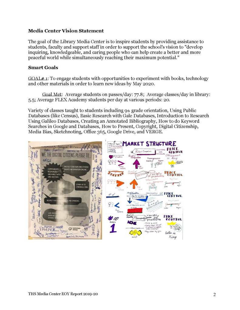
Have you putting together your document? The really long one that (maybe) no one but you will read? Good. It’s going to look something like this page below. I created a table of contents (okay it was a delaying tactic) and it’s 9 pages long with lots of pictures. While I didn’t initially start with it, I decided that the Vision statement helped me focus and since it was at the top, it might get read by someone. <grin>

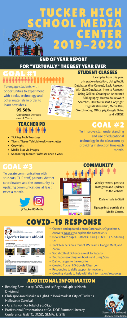
Now it’s time for an infographic. But here is where the WHO is vital. You can make different ones depending on who you are sending it to and who is reading it.
I want to make sure my principal sees it, but I also need to share with the district-level people. And, in turn, they need to share with higher level district people. The higher level people will doubtless NOT CARE about my specific classes on Tuesday – just that I held them. For now, I’m only making one infographic but I have the information to make different ones with different emphasis. Numbers, numbers, numbers are important. Telling my story is also important. AND, my SMART Goals are very important. I prioritized SMART Goals and adding data plus visuals when it enhanced. Did I succeed?
References:
Abercrombie, S. (2017). Advocate for your school library program with an annual report. Knowledge Quest. https://knowledgequest.aasl.org/advocate-school-library-program-annual-report/
National Library of New Zealand. (n.d.). Annual report. https://natlib.govt.nz/schools/school-libraries/leading-and-managing/managing-your-school-library/annual-report

[…] to their teachers, to name a few things. The list of work I did is only partially captured in my End-of-Year Report. Some school district administrators seem to have an implicit or unconscious bias that does not […]
LikeLike
Dr. Robbie, this is awesome. Your approach, and even your analysis of your approach, makes what could be a daunting task seem manageable, highlights the meaningfulness, and truly demonstrates the benefit. Others could possibly benefit from you sharing your process and the need to create some form of EOY report. Hopefully, you’ll consider doing some PL and other sessions, if you haven’t already.
LikeLike
[…] May, I wrote about the process of creating an end of year report. You have to get the right starting point, try to mix the quantitative data with the qualitative […]
LikeLike
[…] 2020 EOY Report (as COVID began) […]
LikeLike
[…] EOY20 – Reporting During COVID-19 […]
LikeLike